


I have edited my photos of Bolton and added layers to create an old affect, to start off with the editing I turned all the photos a duller colour so that it looked very aged. I added in different images of newspapers over the image and reduced the opacity to create a newspaper looking image. I like how they have turned out because they look like old photos, for printing I have ordered them to be printed in a professional printing location online and soon to be delivered so I can organise them onto my collage background.


This is my quick image for the typography that I need to cut up and place into my background, mixing in with the images and different fabrics. I wanted to go with a bold font to make it stand out, I used a different font with the ‘revisited’ text to flow with my app icon which I designed in brief 1.

For the background of my personal project which consists of different types of newspapers, fabrics, train tickets etc I need images to add onto the top. I want to create a college similar to George Grosz’s work because I find his work so interesting and creative. For this experiment, I’ve found free templates of newspapers which I can add into the background; I changed the contrast and brightness of my images so that it looks more old and dull. I like how it has turned out because it suits the background.


Free template link: http://previews.123rf.com/images/razvodovska/razvodovska1109/razvodovska110900015/10612865-abstract-old-newspaper-vintage-background-Stock-Vector.jpg

I accidentally put two of the images into one document with the template but I thought it looked good because it shows more in the image, it looks more busy and appealing.
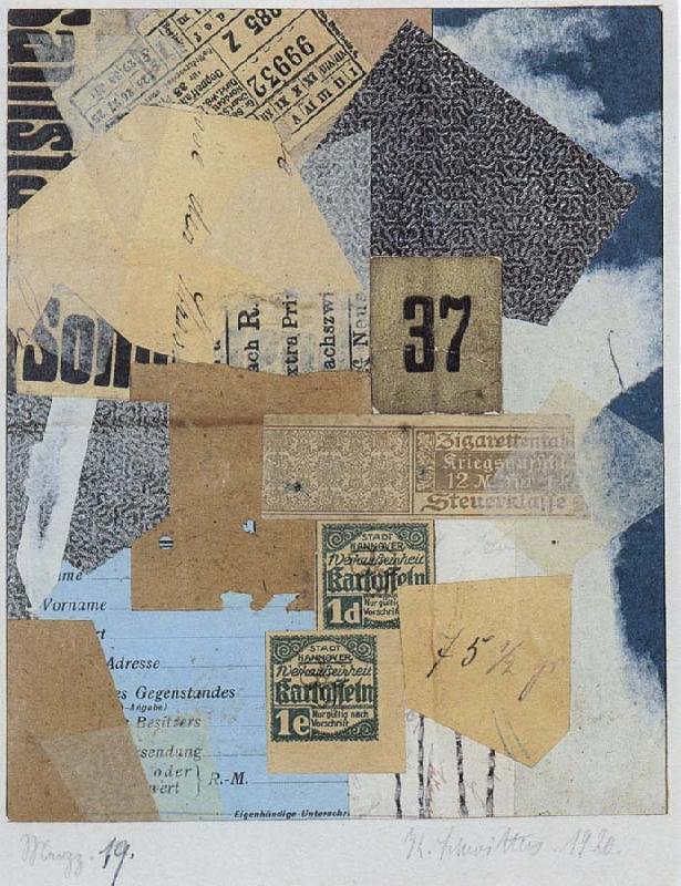
Kurt Schwitters
Unlike the other Dada artists, Schwitters was not based in Berlin, but in Hanover, where he worked until the Nazis exiled him from Germany, when he came to live in The Lake District in England. Throughout his montages, collages and assemblages, Schwitters developed the concept of Merz – ‘the combination, for artistic purposes of all conceivable materials’ – in which he argued that everyday found objects including wood, plasterboard, wheels, cotton were equal in expression to paint itself.
Top 10 Collage Artists: Hannah Höch to Man Ray (2014) Kurt Schwitters. Available from: http://www.anothermag.com/art-photography/3318/top-10-collage-artists-hannah-hoch-to-man-ray
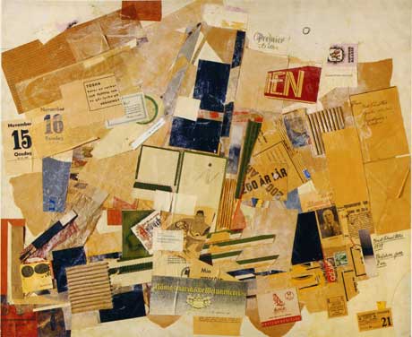
George Grosz
Another collage artist I found fascinating is George Grosz, he was a German known in the early 1920’s, his work is inspiration because he uses the same technique as Kurt Schwitters but tends to include drawings and images of people. Grosz uses quite a lot of boring colours but I like that because it means all of his work stands out at once.


Taylor, Brandon. (2006) Collage: the making of modern art. Thames & Hudson.
This is my idea for my personal project showing what I’d like to include in the piece. I have started my piece by creating the middle part first which is the smaller part that I will glue together when both pieces are completed.


For this I used a an A3 board and covered it in black card so that you weren’t able to see the back of the wood. I sketched out the title of the project however I changed the title while progressing with the image. I decided to put the full exhibition name which is ‘Work Town Revisited’ so that the audience would understand better. I added thick pieces of card under the title and around the board is so that parts of the board would be higher than the original level. This is so that it’d stand out more.


